UX/UI Design
Look, Feel, and Usability
UI design is sometimes mistakenly thought of as how the website looks. It’s not just about colors and shapes, but about presenting the user with the right tools to accomplish their goals. We at BurchGraphics do our due diligence on your company’s metrics and research to design a positive user experience (UX). Always remember that it is your strategies that you use to create your UX, namely the UI, that can enhance (or weaken) it.
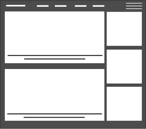
Card Layout
Cards allow sites to present a heavy dose of content in a digestible manner. Cards act as containers for clickable information: bite-sized pre- views to help users find the content they want.
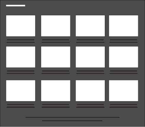
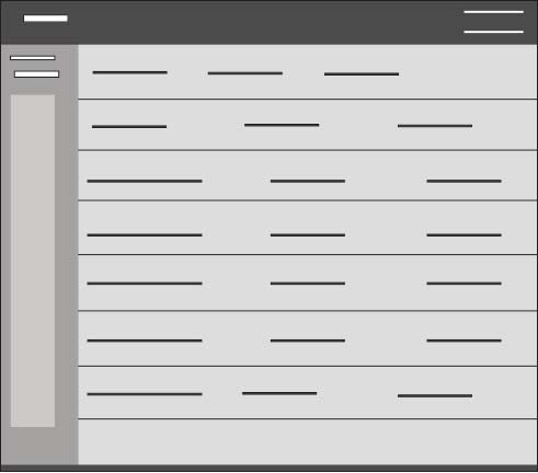
Grid Layout
Grids can vary in size, spacing, and the number of columns. A grid structure makes browsing easier.
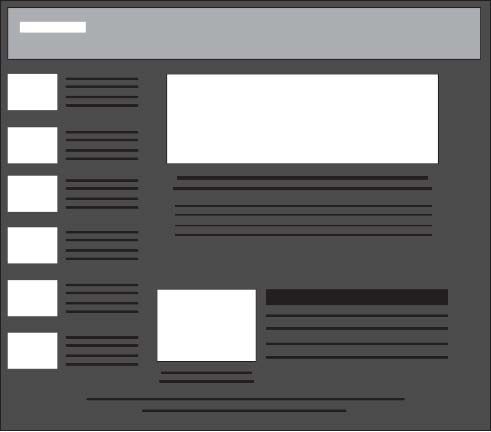
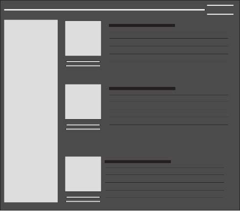
Magazine Style
Like print magazines, this format emphasizes images.The magazine layout also changes up how content is displayed. The left side of the screen might be dominated by a grid of cards, while the right side might have a list of text links.
Container Free Format
Designing without containers puts more power back to the content itself. The container-free format takes minimalism to the next level, stripping away all unnecessary visuals and breaking away from the conventions of other sites.
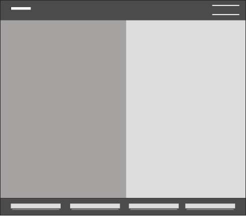
Split-Screen
The split-screen is a choice for displaying two central elements simultaneously. This is a good choice whenever you don’t know which of two elements to feature prominently: do both.
Single Page Web Apps
Using AJAX, single-page web apps load asynchronously and are able to combine multiple actions into one page. When you have a high mobile browsing target audience, single-page web apps are a good choice.
F Pattern
If there is a lot of content – especially text – users will respond better with the F pattern layout, which mimics the way people scan naturally.
Horizontal Symmetry
A visual phenomenon occurring in nature, symmetry is generally regarded as beautiful and creates a sense of order and structure, even trust.